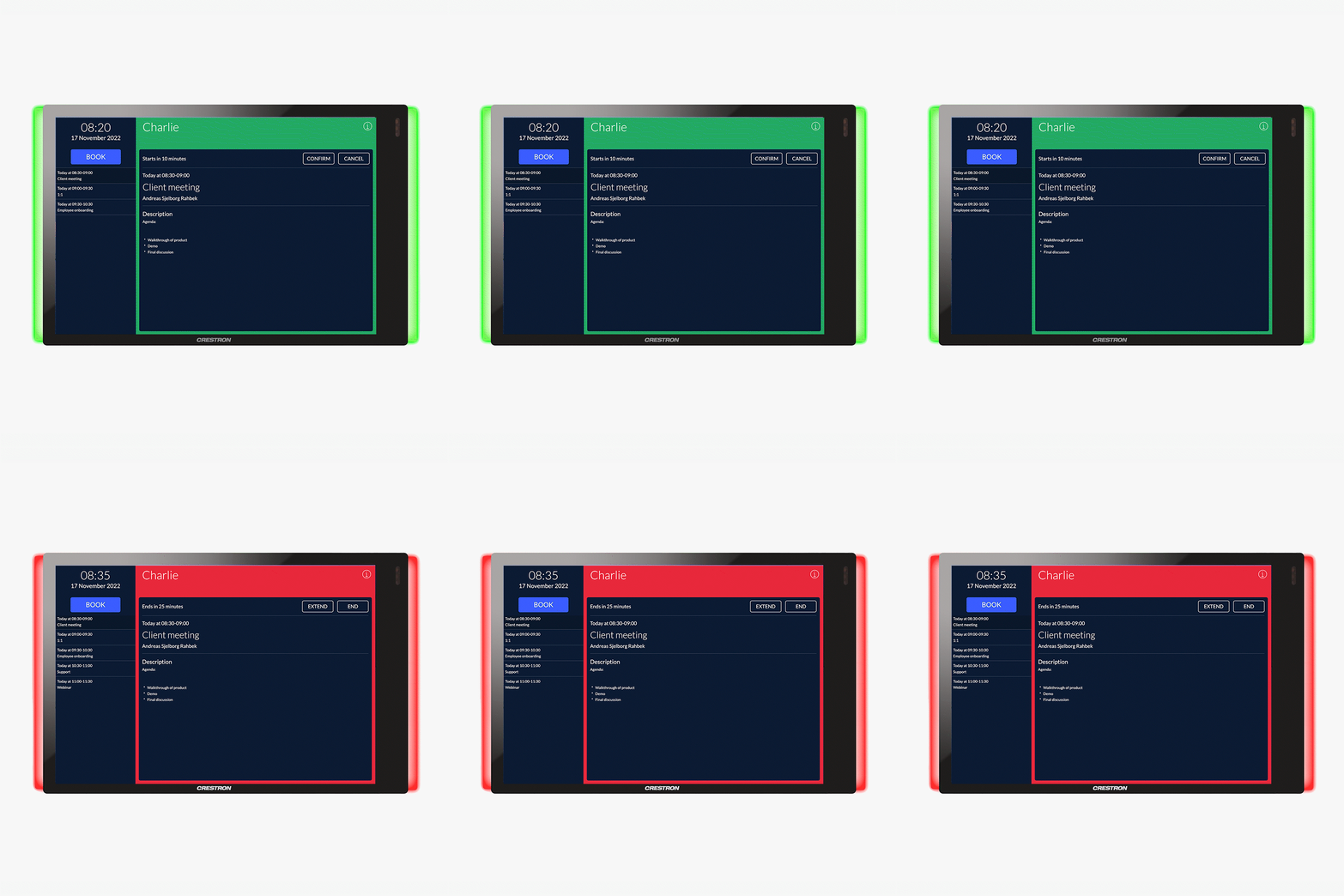
AskCody Displays, Dashboards, and Check-in Kiosks just got a facelift giving AskCody Customers a new modern theme to be used in their offices and sites. The new theme is updated with new colors, fonts, and design, giving a more modern look, while optimizing usability, visibility, and accessibility, such as higher contrast to text, information, and buttons, making it easier for anyone to use them.
AskCody Customers can now access the updated design by selecting "Default" as their preferred theme in the AskCody Portal across both Displays, Dashboards, and Kiosks.
For customers with a custom built theme, to comply with company brand guidelines, you can still take advantage of the new updated designs, visibility, and accessibility while staying brand compliant with your colors and logo.
Please reach out to your AskCody Customer Success Manager or contact AskCody Support.
What are Displays and Dashboards?
AskCody Displays and Dashboards are the touchscreen devices and panels that are mounted right outside of your meeting spaces, typically next to entrances, or in high traffic areas like Receptions or Conference Centers. Displays and Dashboards give you the ability to view location, free/busy status, and meeting details immediately—and reserve and book an available meeting space on the spot. With rich, large text and color-coded indicators (and integration with LED indicators) you can see the meeting space’s availability from a distance, and intuitively know what's free or busy.
AskCody Displays and Dashboards show meeting details and information scheduled via Microsoft Outlook 365 calendaring applications or Microsoft Teams. With meeting details prominently displayed, attendees can confirm they’re in the right meeting space, at the right time, and for the right meeting, while checking in to meetings entering the meeting room, otherwise freeing up unused space by cancelling ghost meetings.
Increase visibility with new display design
Updating the Default theme, design, and interface to our Room Displays we wanted to improve visibility, usability, and accessibility by highlighting the most essential information and used features such as Quick Booking a Room + All meeting information. As a result, we decided to push the green "available" and the red "occupied" colors to the background, making all meeting information and details stand out with a clearer, dark blue overlay.
The updated Theme is a clean, user-friendly interface that connects with your office atmosphere. Still, users get at-a-glance details about the meeting space, including its location, availability, and in-room equipment. For a reserved meeting space, you can see key meeting details, such as meeting title, meeting schedule, duration, and meeting organizer, and can easily confirm the meeting to claim the room. And still, faulty in-room. equipment can be reported from the screen, notifying facilities teams.
Try out the new Room Display Theme by selecting the "Default" theme when editing your Display in the AskCody Portal. Learn more about changing Themes in our Help Center.
We still support customized wallpaper and status indicators to allow our customers to stay on-brand, matching company colors, logo, and culture. Admins can change the default look of the panels through the AskCody Admin Center after having customized the Theme with an AskCody Solution Specialist. Contact us now to learn more.

One Dashboard - all meetings. No more wasting time, no more feeling lost!
AskCody Meeting Dashboards are used to get an overview of the activities and events in meeting and conference rooms, or to show desk reservations and employee availability. Dashboards can be viewed in different List-views (similar to the airport departure displays) or as a Tile-view.
Organizations love to place AskCody Meeting Dashboards in high-traffic areas like the reception, office entrance, or within ‘Meeting Room Clusters’. This way, everyone can quickly see where the nearest free room is right now. It’s like having a live, interactive map of your office's meeting landscape. This real-time summary of the office schedule, integrated seamlessly with Outlook and Microsoft 365, helps everyone stay on top of what's going on. Whether you’re an employee trying to find an available room or an external visitor navigating your way around, these dashboards provide a powerful overview of the day's events and activities. You’ll always know the office availability, free/busy status, and where you need to go next.
But that's not all. Our new themes for Dashboards are designed to not only improve visibility but also enhance accessibility for everyone. We've aligned the design with the rest of our screen-based software applications, so it looks and feels like a cohesive part of your digital workspace. This means you get a cleaner, more intuitive interface that makes it easier to find the information you need at a glance.
Try the new Dashboard design by selecting the "Default" theme in the AskCody Portal. Learn more about changing Themes in our Help Center.
A simplified, standardized, and unified check-in experience
For many external visitors, the AskCody Check-in Kiosk is the first point of contact with your organization. Therefore, we wanted to improve visibility and usability, making an even better first impression by interacting and engaging with your company, while providing easy-to-read instructions guiding visitors to check in, in seconds.
You can apply the updated Check-in Kiosk theme by going into the Admin Center choosing Visitors + Check-in Kiosk Templates. In here you can choose the "Default" theme to get access to our modern design. Learn more about changing Themes in our Help Center.With our updated user interface to our Check-in Kiosks (as part of our complete Visitor Management solution) we wanted to simplify, standardize, and improve the check-in experience at receptions and front desks. By providing a seamless check-in experience, we're giving peace of mind to everyone who enters a new building, office, or site, while supercharging front desk personnel with the tools and overview they need to stay ahead of who's onsite, off-site, or planned to visit later.
This also means no more scrambling around to find employees when their guests arrive, misspelled names and awkward situations, handwriting name badges, and tracking down signed agreements. AskCody is enabling receptionists to shine by quickly and effectively solving front desk challenges before they turn into issues impacting first impressions at your organization.
A part of a bigger update
Upgrading and redesigning the Themes and layout of our Displays, Dashboards, and Check-in Kiosks is part of a bigger update creating a unified look and feel across the entire platform, improving usability, visibility and accessibility, while providing better guidance and navigation - All providing a better user experience helping you getting the most of the AskCody Platform, improving your workplace experience.
Why is this so important? Well, when everything from your displays to your check-in kiosks has a consistent design, it makes it a whole lot easier to navigate and find what you need quickly. Imagine walking into your office and instantly understanding the layout and available features just by looking at a screen – that’s the kind of seamless experience we’re aiming for.
To sum it up: Lately, we have given customers an improved interface for AskCody, including redesigning:
So, what is next?
We have come a long way, but there are still major updates in the pipeline to provide an even more unified and intuitive platform. Rest assured you will be kept informed about the changes coming.
The updates will include changes to the menu structure and navigation in the Management Portal, changes to modules like Insights, and the biggest, most extensive update to AskCody since our launch with an all-new module displaying information about the meeting, services, and visitors and a unified workplace calendar, giving Office Admins, Service Managers and Meeting Planers control of what goes on, where and when.
Stay tuned!


