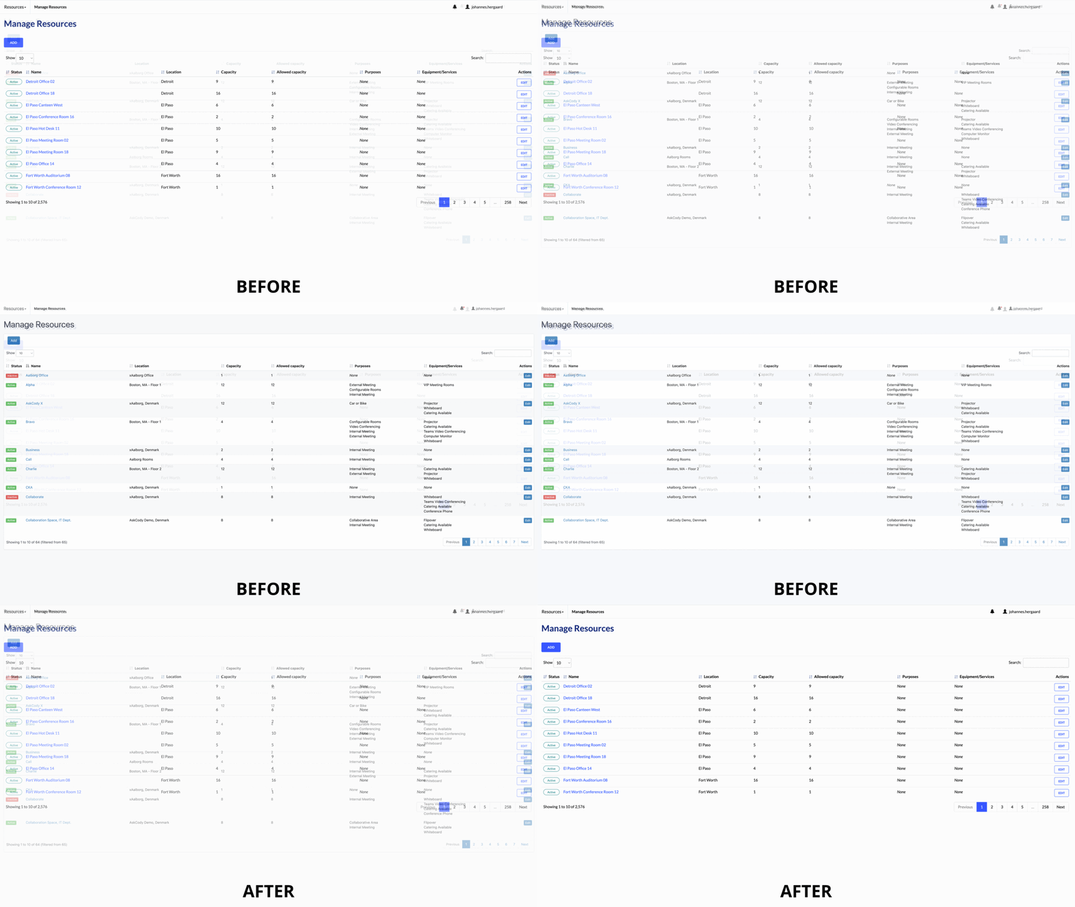
We gave AskCody a new intuitive interface changing the colors and layout of our Outlook add-ins, Management portal, Check-in screens, Displays, and Dashboards. The entire AskCody Platform has been updated to enhance usability making it easy for end-users to operate our interface. As a result, making onboarding faster and giving you a faster way to perform critical tasks for your users.
New intuitive look and feel for AskCody
We updated the entire AskCody changing the colors, text, and buttons of:
- The Management Portal
- Outlook Add-ins
- Check-in screens
- Displays
- Dashboards
The new intuitive interface will make it easier for customers to utilize AskCody - while providing a unified and modern look across the entire Platform. We hope you'll enjoy the new experience.
In August we presented the first improvement with a new look for the Management Portal, which was the first step in creating an aligned look and feel across the entire Platform.
Now we updated the Outlook Add-ins, Check-in screens, Displays, and Dashboards providing users with a more modern, intuitive, and user-friendly interface. Our goal with the change was to highlight important information and make it easier to perform critical tasks.
You can get an impression of the changes we have made in the GIF below.


