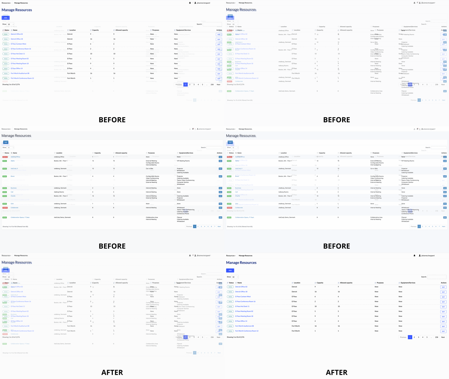
If you have visited the AskCody Management Portal lately, you might have noticed that it looks different.

New look and feel in the Management Portal
In June we published a major infrastructure upgrade to AskCody with the goal of "elevating our product, taking the first step into a new era of how Meeting Management should be". Our promise to customers was clear: expect new features and updates much faster.
As a part of improving our entire platform, we have now improved the user experience of the Admin Center and Management Portal. The changes include new colors, text, and visual improvements creating an intuitive experience navigating the platform. All changes are solely visual, so no changes to the menu structure or the functionalities of buttons. Everything is exactly where it was before - it just looks more modern and feels more intuitive.
Improving the user experience
This visual update not only makes the interface look and feel more modern - it also increases the platform's usability and manageability.
We have simplified the colors in our interface to provide more visual attention to the most essential elements. Ensuring you never miss critical information such as status indicators, buttons, and messages.
Try it out 👋
First of multiple visual improvements
In June we promised that: "UX aspect of the Admin Center and Management Portal will soon be updated to the next level with a complete redesign and better manageability" - and we are not stopping there.
This is only the first of multiple visual improvements across the AskCody platform. Going forward, we have a prioritized list of products that will get a visual update. We are starting with the Add-ins and afterward giving our Displays, Dashboards, and Check-in Kiosk a new visual appearance.
Stay tuned!
So, what is next?
If you want to be updated on the next projects for AskCody. You can visit our Statement Of Direction to get an updated list of prioritized themes.


